ReloPortal Redesign
Phase 1: Scope and Research
ReloPortal Redesign
Phase 1: Scope and Research
ReloPortal Redesign
Phase 1: Scope and Research
BuzzVibe | Engagement & Analytics Case Study
Designing an engagement analytics platform that helps product and marketing teams translate behavioral data
into clear decisions across digital channels and campaigns.
Enabling cross-functional teams to move from fragmented engagement signals toward coordinated action.
BuzzVibe | Experience Design Lead | Consumer Engagement/Saas |
Platforms: Web & Mobile
Overview
BuzzVibe is an engagement analytics platform designed to help product and marketing teams understand how users interact with digital products and campaigns. The platform consolidates behavioral data across channels and translates it into dashboards and reporting tools that reveal engagement patterns, campaign performance, and user trends.
The goal was to create a system that allowed teams to quickly interpret engagement data, identify opportunities for improvement,
and make informed decisions about product and marketing strategies.
Role & Leadership
Led the design of the engagement analytics platform, defining the dashboard structure, navigation model,
and data visualization framework used to interpret engagement trends across campaigns and user segments.
Worked closely with product managers, engineering, and analytics teams to translate behavioral data into structured dashboards and reporting workflows that supported campaign optimization and product decision-making.
Problem
Teams lacked a unified way to interpret engagement signals across user touchpoints.
Existing tools surfaced data but did not provide sufficient clarity to support coordinated decision-making.
The opportunity was to create decision-support workflows that enabled teams to move from observation to action.

Old mobile onboarding showing a single long form with many required fields, no progress indicator, and dense copy that caused confusion and high drop-off

Old desktop onboarding page with a single, long form card, small labels, and no step indicator, making the process feel lengthy and intimidating on larger screens


Old mobile dashboard displaying a static feed of generic cards and no personalization, which lowered relevance and daily engagement
Old desktop homepage with cluttered widgets and no clear hierarchy,
making it difficult for users to find relevant tasks or content
System Redesign & Platform Alignment
The redesign aligned engagement signals with product and marketing workflows.
Interaction models were structured to support interpretation while reducing cognitive friction across teams.
Key Artifacts
Design artifacts focused on clarifying workflows, reducing cognitive load,
and creating a cohesive visual and interaction language across the platform.


Side-by-side journey map comparing the old linear onboarding with the new three-step onboarding, highlighting pain points and the streamlined path to activation.
Figma-style component library demonstrating buttons, input fields, cards, navigation components, and color tokens organized for cross-team reuse
and governance.
Solution
A structured engagement platform enabled teams to interpret user signals and coordinate actions.
Before & After Platform Evolution
Key screens highlighting the transition from fragmented analytics views to a cohesive, scalable engagement system.


Redesigned mobile onboarding in three clear steps with a top progress bar, large readable typography, inline validation, and a prominent continue button to reduce cognitive load
Redesigned desktop onboarding using a centered multi-step card layout,
a horizontal progress tracker, inline validation messages,
and generous whitespace for better scanning

New mobile personalized dashboard with adaptive content cards, prominent section headers, and a bottom navigation bar for quick access to home, explore, notifications, and profile.

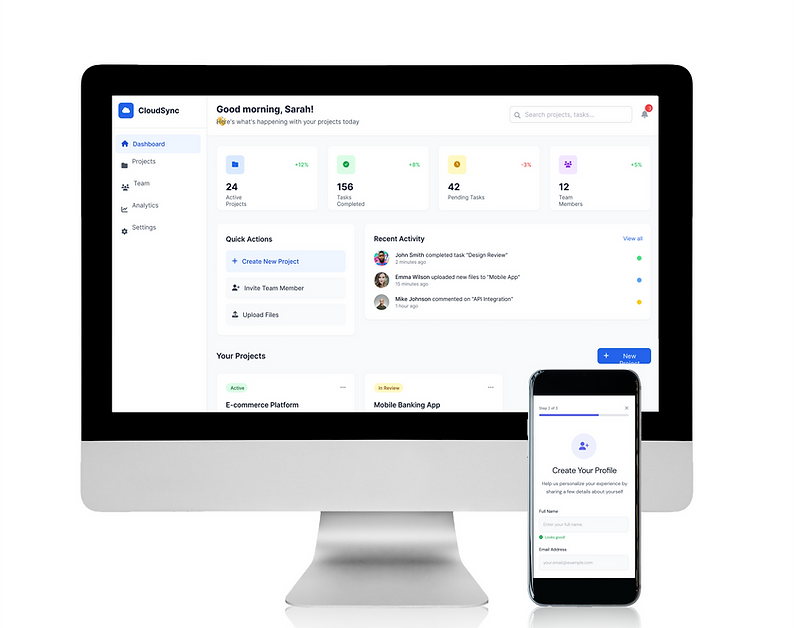
Redesigned desktop dashboard with a left-hand navigation, a top search bar,
and a modular grid of personalized recommendation cards, delivering a clearer path to action.

Unified design system library demonstrating polished, reusable components across platforms, ensuring consistency and speed of delivery.
Results
The platform improved visibility into engagement dynamics across teams.
Teams were better equipped to interpret signals and align actions with strategic objectives.

Minimal analytics slide comparing before and after metrics: onboarding completion up 27 percent, retention up 25 percent, and delivery speed up 30 percent.
Key Takeaways
Designing the BuzzVibe engagement analytics platform reinforced the importance of translating behavioral data into clear,
actionable insights for product and marketing teams.
The project demonstrated how structured dashboards and visualization frameworks can help organizations
move beyond raw analytics and toward meaningful engagement strategies.
It also highlighted the value of aligning product, marketing, and analytics teams around shared metrics and reporting workflows, enabling faster iteration on campaigns and product experiences.